A good-looking website is nice to have, but these days it’s just not enough. Most people arrive on a site looking for answers, reassurance, and a fast way to take the next step. Whether you’re a service provider, an ecommerce store, or even a venue hire business trying to lock in more bookings, the same principles apply: clarity, trust, and a frictionless user experience.
High-converting websites aren’t built around trends. They’re built around how people behave online. With attention spans shrinking and competition increasing, your website has to work hard to convince someone to stay, explore, and eventually enquire or buy.
Here’s what actually moves the needle.
The moment someone lands on your homepage or landing page, they need to understand three things: what you do, who it’s for, and how they can take the next step. This happens “above the fold” – the area you see before scrolling.
A strong, straightforward headline paired with a short sentence of supporting detail is usually all you need. Add a clear call to action, and you’ve already outperformed half the websites on the internet.
For example, if you’re offering venue hire, a headline like “A modern event space for weddings, corporate functions, and private celebrations” instantly tells visitors they’re in the right place. There’s no guessing, no digging, and no confusion.
People don’t read websites the way we think they do. They skim. A good layout guides a visitor through your content without them feeling overwhelmed.
This is where spacing, headings, images, and content blocks matter. If everything looks crowded and noisy, people give up. If it’s spaced out, consistent, and predictable, users feel comfortable moving through the page.
For a venue hire business, this might mean breaking the page into clear sections: capacities, features, gallery, pricing guidance, FAQs, reviews, and availability. Visitors shouldn’t have to hunt for important information – it should feel effortless to find.
Images still carry more weight than text online. But the type of images you choose matters.
Authentic photography – especially of real customers, real products, or real spaces – builds trust faster than glossy stock images. People want honesty, not perfection.
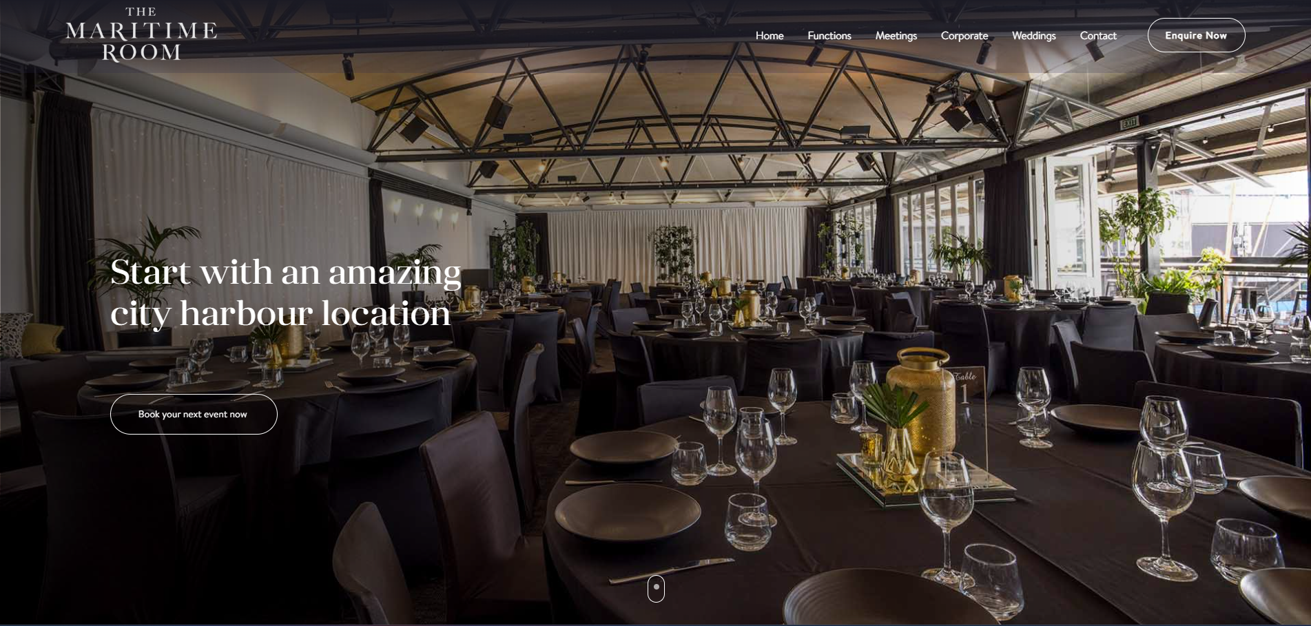
A venue hire website like The Maritime Room is the perfect example. A real gallery showing different event setups, lighting styles, and seating layouts does far more for conversion than a generic photo of people shaking hands in a boardroom. The more real it feels, the easier it is for someone to picture their own event happening there.
Nearly half of users leave a website that takes more than three seconds to load. Slow pages also hurt your SEO, making it harder for people to find you in the first place.
Google’s Core Web Vitals still play a big role in both rankings and user behaviour. A site can look incredible, but if the images are too heavy, the hosting is slow, or the page is full of bloated scripts, people won’t wait around.
Venue hire websites often struggle here because image galleries are typically massive. Optimising image sizes, using next-gen formats, compressing files, and investing in good hosting can make a world of difference.
Visitors want to know they can trust you before they contact you.
This is where testimonials, case studies, certifications, client logos, and star ratings become invaluable. They act as social proof and reduce the fear of making the wrong decision.
For a venue hire business, themed testimonials like “Perfect for our 50-guest wedding” or “Great layout for our company workshop” help people understand whether the space fits what they need. The more specific, the better.
A good call to action doesn’t pressure someone – it guides them.
“Submit” is vague and unhelpful. But something like “Check Availability”, “Book a Tour”, or “Request Pricing” clearly sets expectations.
Most service websites also benefit from having multiple CTAs placed throughout the page. Not everyone is ready to take the next step at the same moment, so giving them the option at different points increases your chances.
Mobile accounts for a huge percentage of web traffic now, especially for service-based businesses. People browse on their phones during commutes, evenings, and weekends.
If your buttons are too small, your menu is messy, or your forms are a nightmare on mobile, your conversion rate suffers instantly.
This matters even more for industries like venue hire, where many initial searches happen on mobile. A smooth mobile experience can directly increase enquiries.
Good website copy isn’t fluffy. It’s clear, helpful, honest, and easy to read. The best converting pages tend to answer common objections early: pricing, availability, inclusions, process, and how long things take.
For venue hire, this includes practical details like parking, catering options, guest capacity, accessibility, and noise restrictions. When visitors don’t have to work hard to find answers, they enquire sooner.
Finally, high-converting websites don’t stay static. They evolve based on real user behaviour.
Analytics tools show you how people navigate your website – where they drop off, what they click, and what pages drive the most enquiries. A/B testing different headlines, CTAs, colours, images, and layouts helps you find what actually converts, instead of guessing.
For venue hire, even testing something simple like “Book a Viewing” versus “Check Availability” can lead to a measurable difference in lead volume.
A high-converting website isn’t about fancy design trends. It’s about clarity, trust, speed, and making it easy for people to take action. Whether you’re offering marketing services or venue hire, these universal principles help turn visitors into actual customers.
If you want help improving your website’s conversion rate, we can create a personalised outline or audit to show exactly where to start. Give us a call today