Their own beautiful design execution and craftsmanship was something we strove to reflect in the new website they asked us to build for them.
Their own beautiful design execution and craftsmanship was something we strove to reflect in the new website they asked us to build for them.
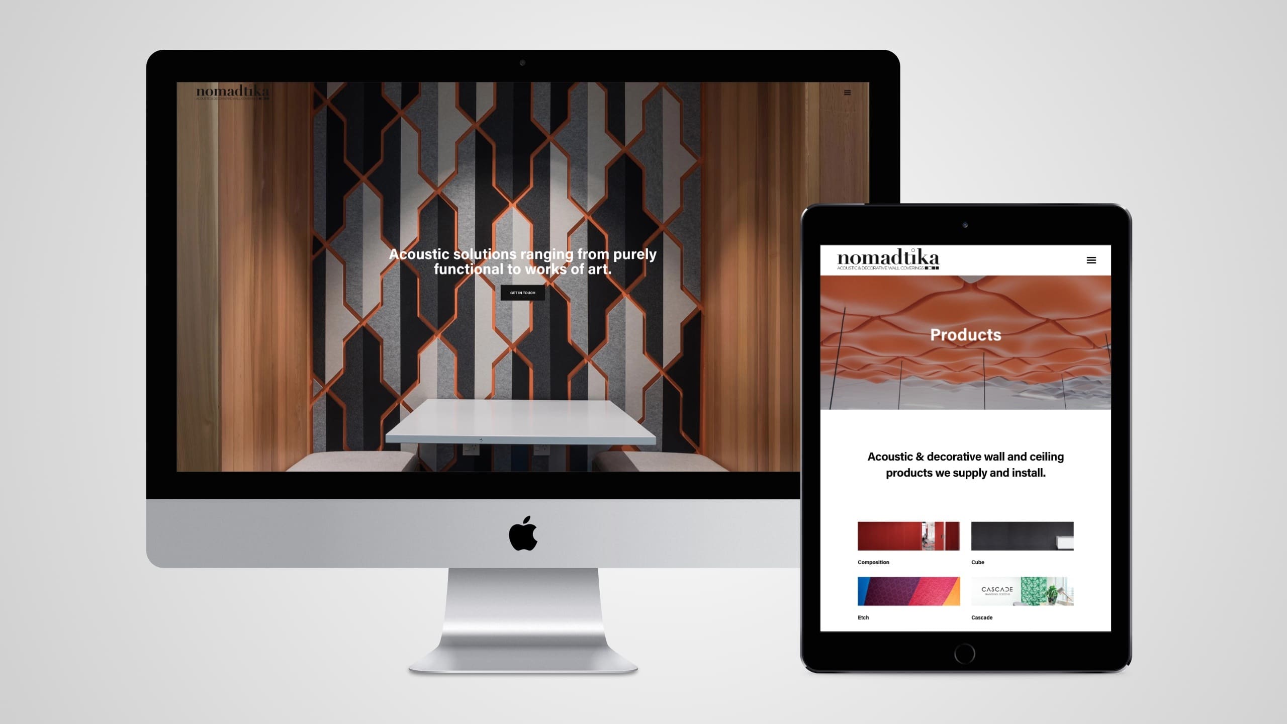
We put a lot of effort into making the above-fold banner exactly right. The symmetry, the shading, and the placement of the logo and the call to action, were all carefully tweaked until we were happy they’d do their job as well as possible. Now, everyone who lands at the home page gets an emphatic visual statement of what Nomadtika is all about – reducing the bounce rate and encouraging engagement as a result.
One challenge we faced was to demonstrate the extraordinary range of Nomadtika’s work, without overwhelming the viewer with too much visual information. To do this, we used plenty of white space, an almost exclusively monochrome colour scheme, and imagery that was specifically developed and chosen to create a powerful impression.
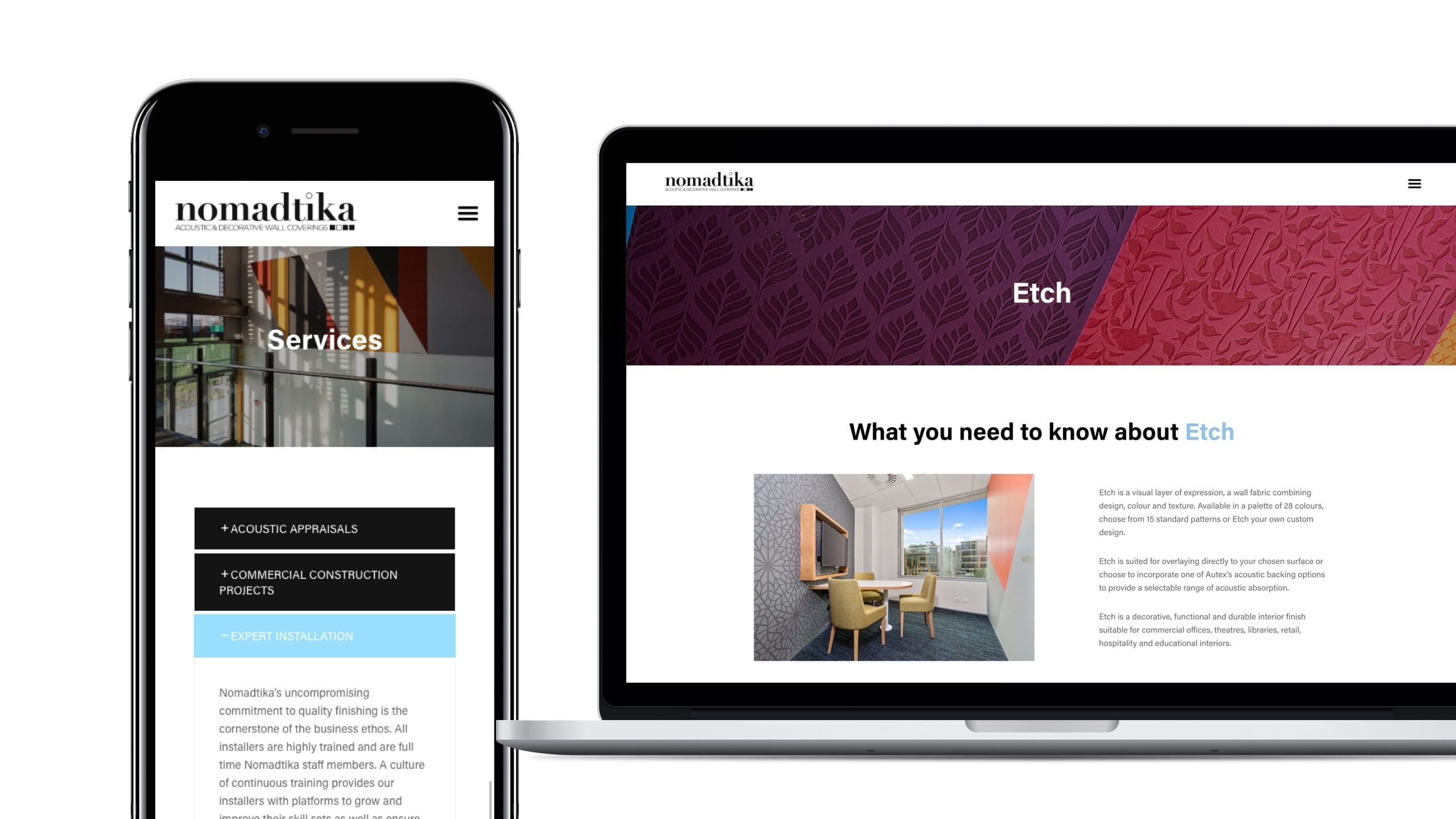
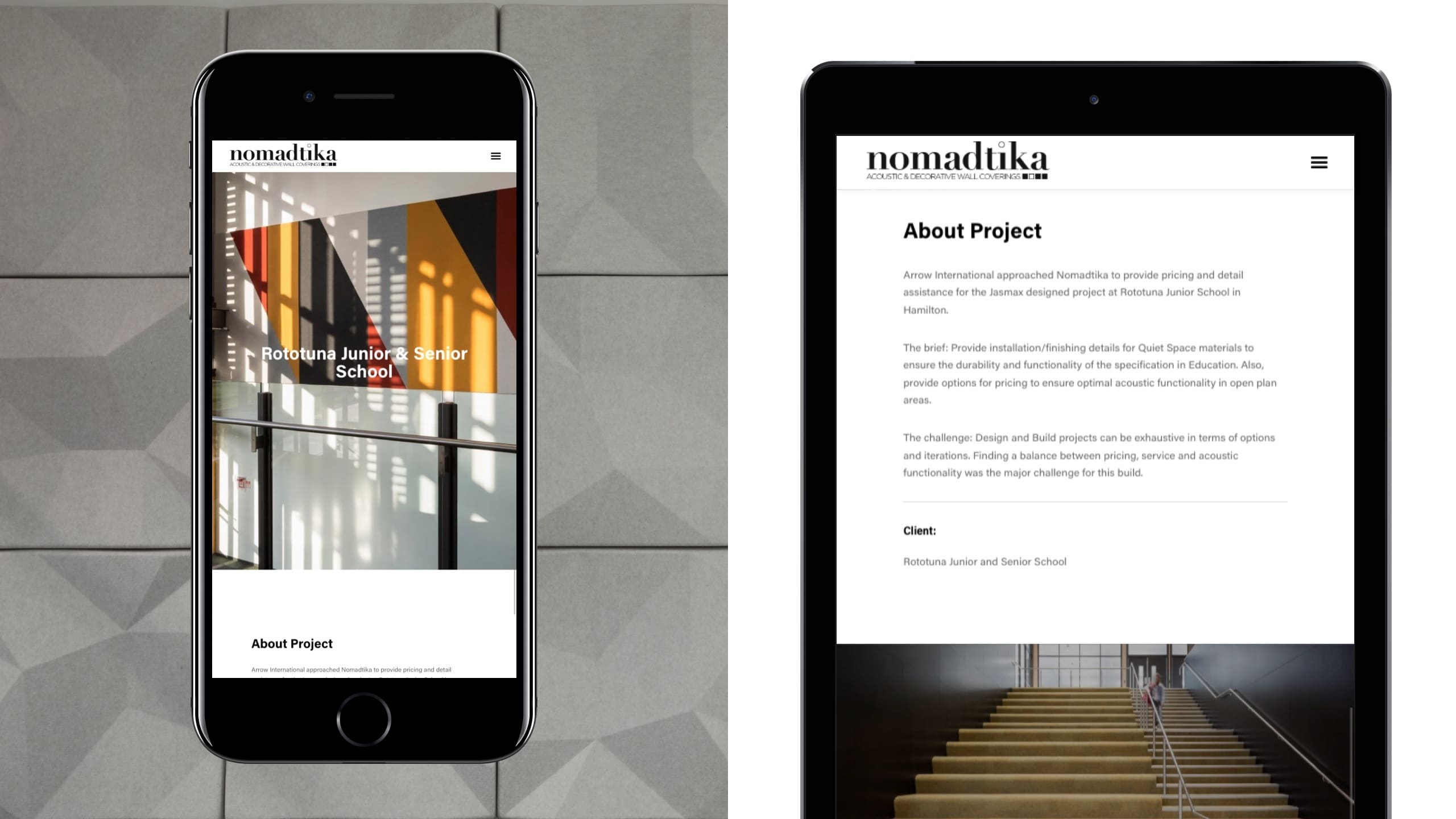
Whereas a regular E-commerce site needs to be functional on mobile devices, a design-heavy website like Nomadtika’s needs to be even more than this. It needs to look fantastic, no matter how small your screen might be. Our designer worked hard to let the visuals shine through and persuade the viewer, even on a mobile device.